Rethinking the ADS author network visualizations
I created a new type of interactive author network visualization for the Astrophysics Data System and built it in D3.
The Problem: Force Directed Chaos
For any set of documents in the Astrophysics Data System, you can construct an author network in which the nodes represent authors and links represent co-authorship relationships between them. Ideally, this information could quickly answer questions like:
- Which authors in a field tend to collaborate the most broadly?
- Which collaborations over the course of an author's career have resulted in the most influential papers?
- What discrete sub-topics has an author focused on over the course of his or her career?

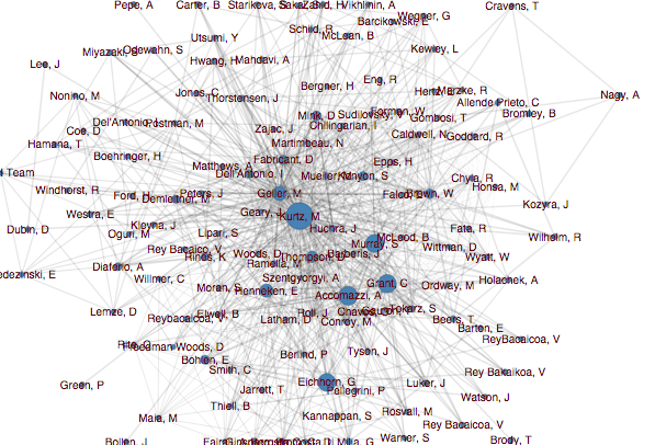
When I first started working at ADS, the author network was visualized using the somewhat crowded force-directed layout shown above, which did not do a great job of answering those questions.
My First Redesign: Return of the Hairball

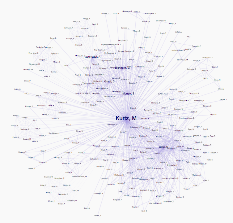
As one of my first data visualization tasks ever, I tried to redo the graph visualization in order to make it more readable. I removed the circles, and fiddled with the force directed network settings to make groups more apparent. The user could zoom, pan and drag nodes to reorganize the network in order to explore the relationships between authors.
So, for instance, in this network, unlike the first one, you can see that Michael Kurtz works with two distinct groups. Still, this version was quite similar to the original implementation. In addition, the animation of the nodes finding their points of equilibrium was very taxing for the browser, as there could be hundreds of author nodes and thousands of links in a single visualization.
The Solution: Automatic Group Detection and a Hierarchical Layout
Check out the live version here.
I wanted a visualization that could support user exploration into details like the zoomable node-link graph, but one which could also tell you at a glance some important features of the network. I started reading a bit about graph analysis and realized that some of the features I was relying on the force-directed node layout to show the user (like groups and collaborator nodes) could actually be calculated more efficiently using algorithms. I used the Python NetworkX library to add group information to the data.
I realized that there were new dimensions to the data that the visualization could show. The papers themselves that formed the basis of the node-link structure could be immediately accessible to the user, possibly allowing the network visualization to be an alternate way to view the results list. In addition, cumulative characteristics of the groups—like long-term influence (citations), or short term popularity (reads), could also be useful to show.
I ended up combining d3's sunburst layout and the hierarchical edge bundling layout to make a two-level ring structure that shows individual authors along the outer radius, and allows the user to view group summaries along the inner radius. You can toggle on and off a link layer that shows inter-group linkages and thus any important collaborator nodes.
The video below shows the same data as the above two graphs—the collaboration network for the astrophysicist Michael Kurtz. The obvious two groups of the node-link network above here become three groups (the purple on the one hand and the yellow and red on the other). By clicking the link overlay checkbox, you can actually see that the yellow and red groups have cowritten many papers together, and thus the two groups are closely related, yet distinct.